& prototypes
Overview:
MSC is a B2B industrial supplier specializing in solutions and products for maintenance, repair and operations. The website generates $1B in revenue annually. MSC's customers are segmented by spend and opportunity within these categories: very small, small and medium customers. Large and government customers are managed by the sales team.
The Problem:
Through feedback from MSC's web-based survey, ForeSee, I curated data over a period of three months that pointed to a number of customers having issues finding the order summary after building a large cart. The customer had to page through a number of items in their cart in order to get to the order summary.
The Goal:
How do we make the order summary easier for our customers to find. The customer will feel less frustrated, and check out faster. This will help the business by decreasing cart abandonment rates.
User Research:
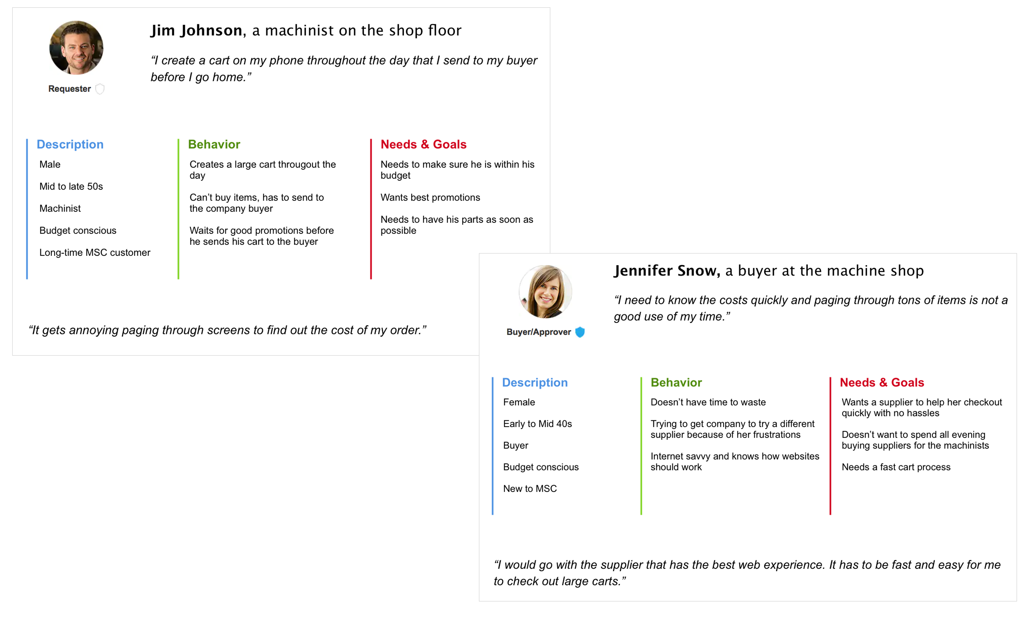
I contacted 5 users from the survey to get more information. I created a discussion guide to find out:
- Customer demographics
- Customer behaviors
- Customer wants & needs
Synthesizing Research:
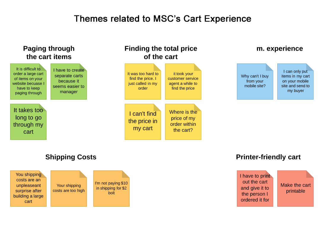
I created an affinity map to organize the user's feedback into themes.
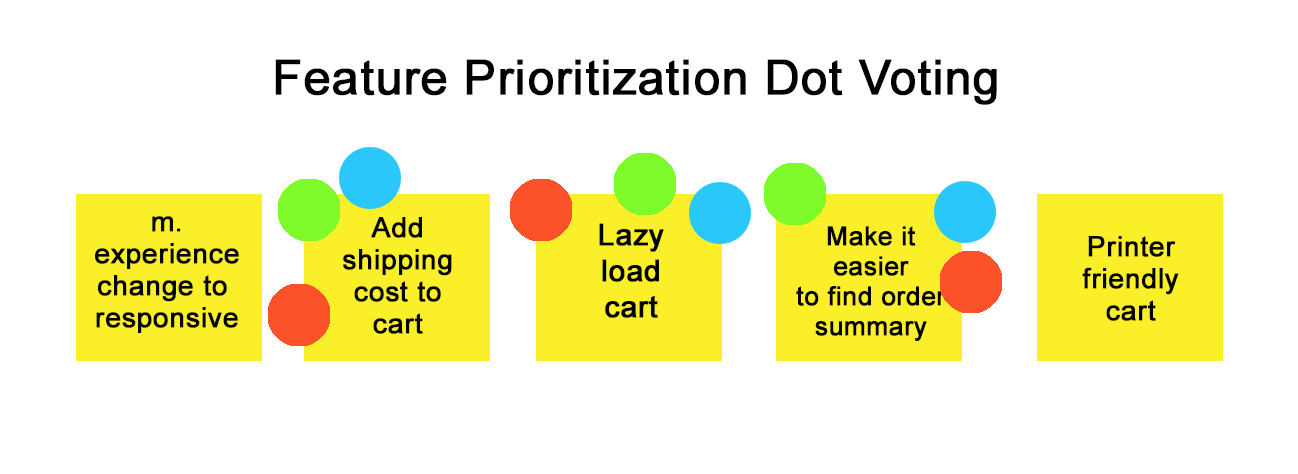
I presented all of my user research to the team, which included a product manager and engineer. From there we brainstormed ideas on how to address the customers' pain points. We then voted on feature prioritization. We voted on features to pursue that maximize business and user benefits.
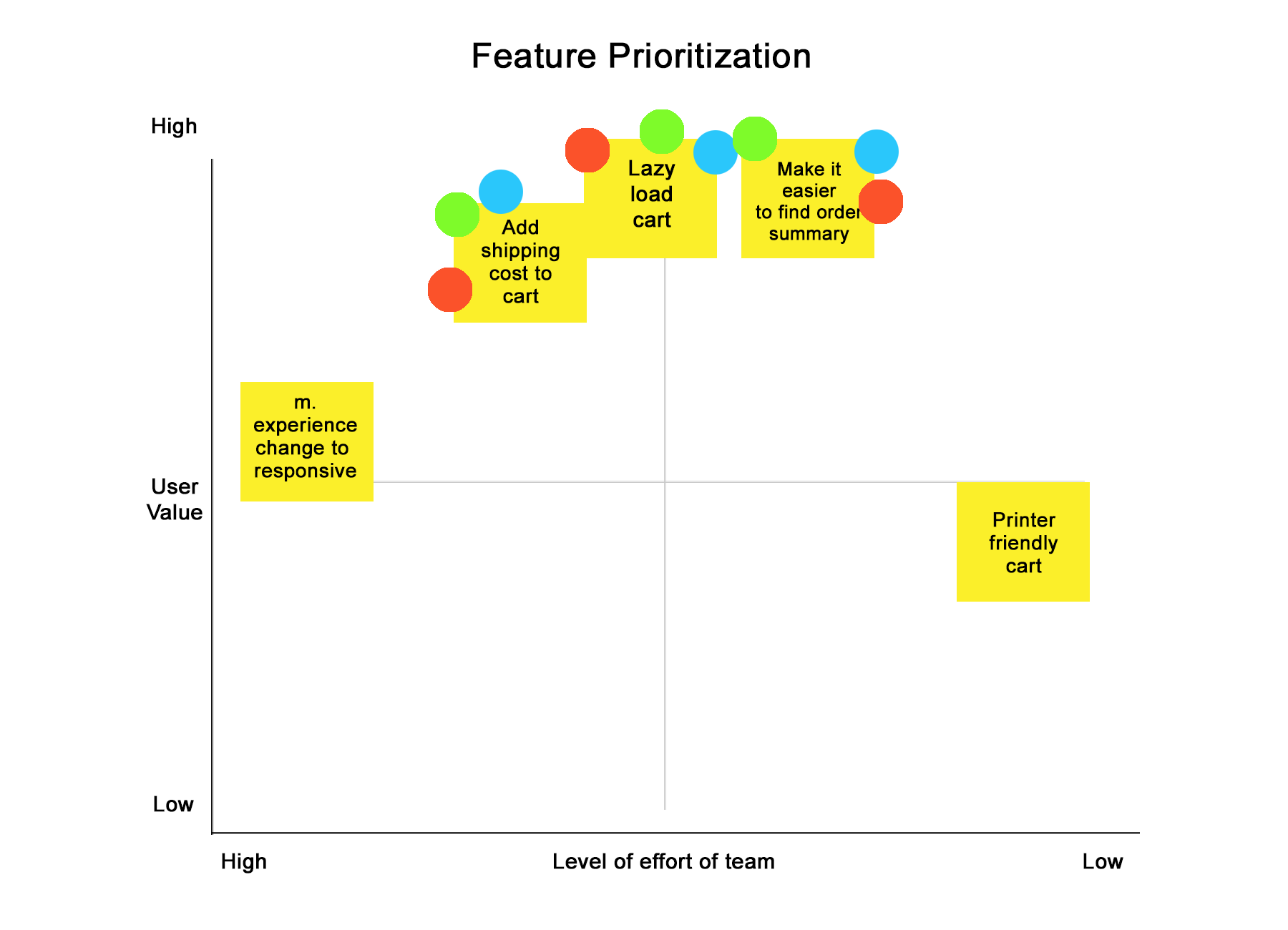
Next I plotted the features on the chart considering level of effort versus user value.
Sketching:
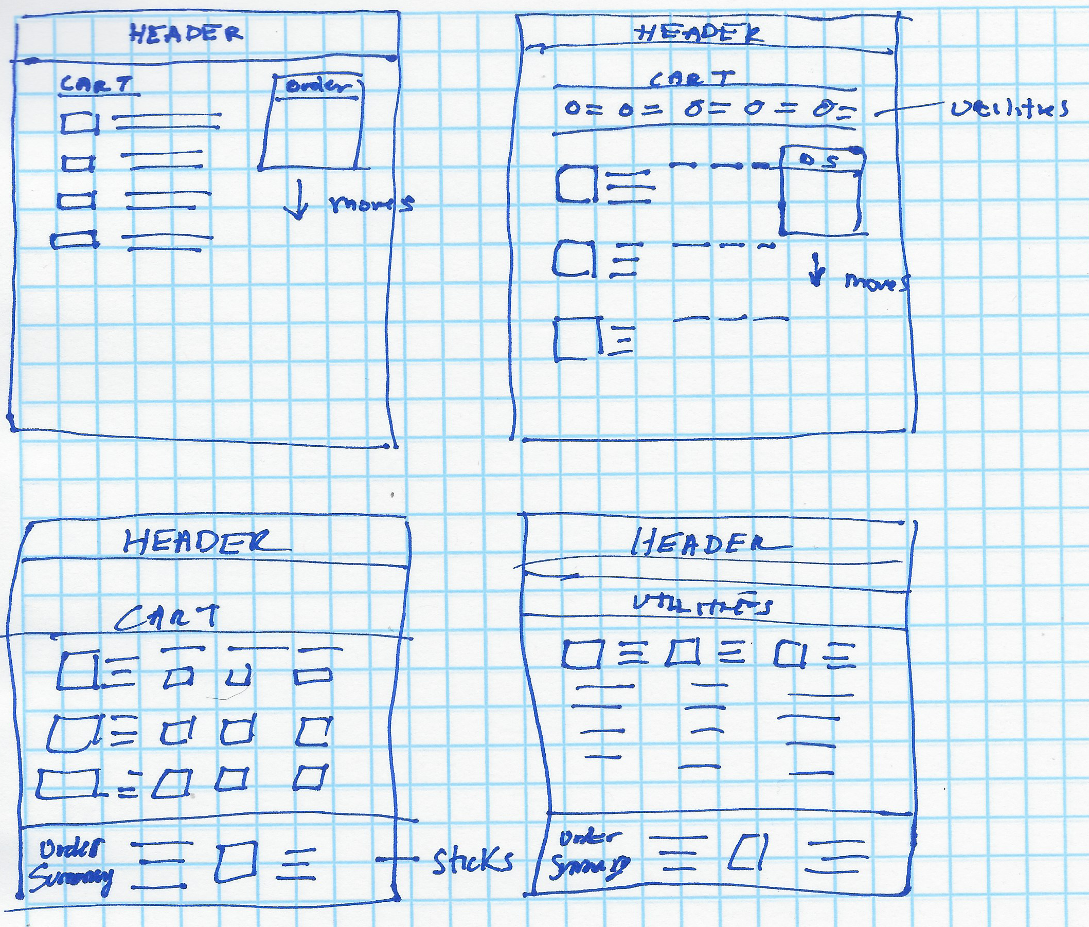
I sketched out some solutions to make the order summary findable.
The Solution:
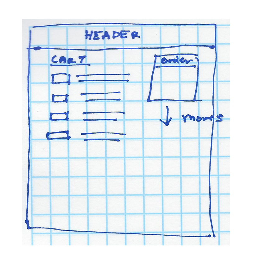
Based upon best practices, we decided to go with our solution with the order summary on the right side of the cart items. The items in the cart would no longer paginate, but would instead lazy load as the customer scrolls down through the cart items, so the cart would essentially be one page. The order summary would scroll as well. We presented our solution to the stakeholders.
Presentation to Stakeholders:
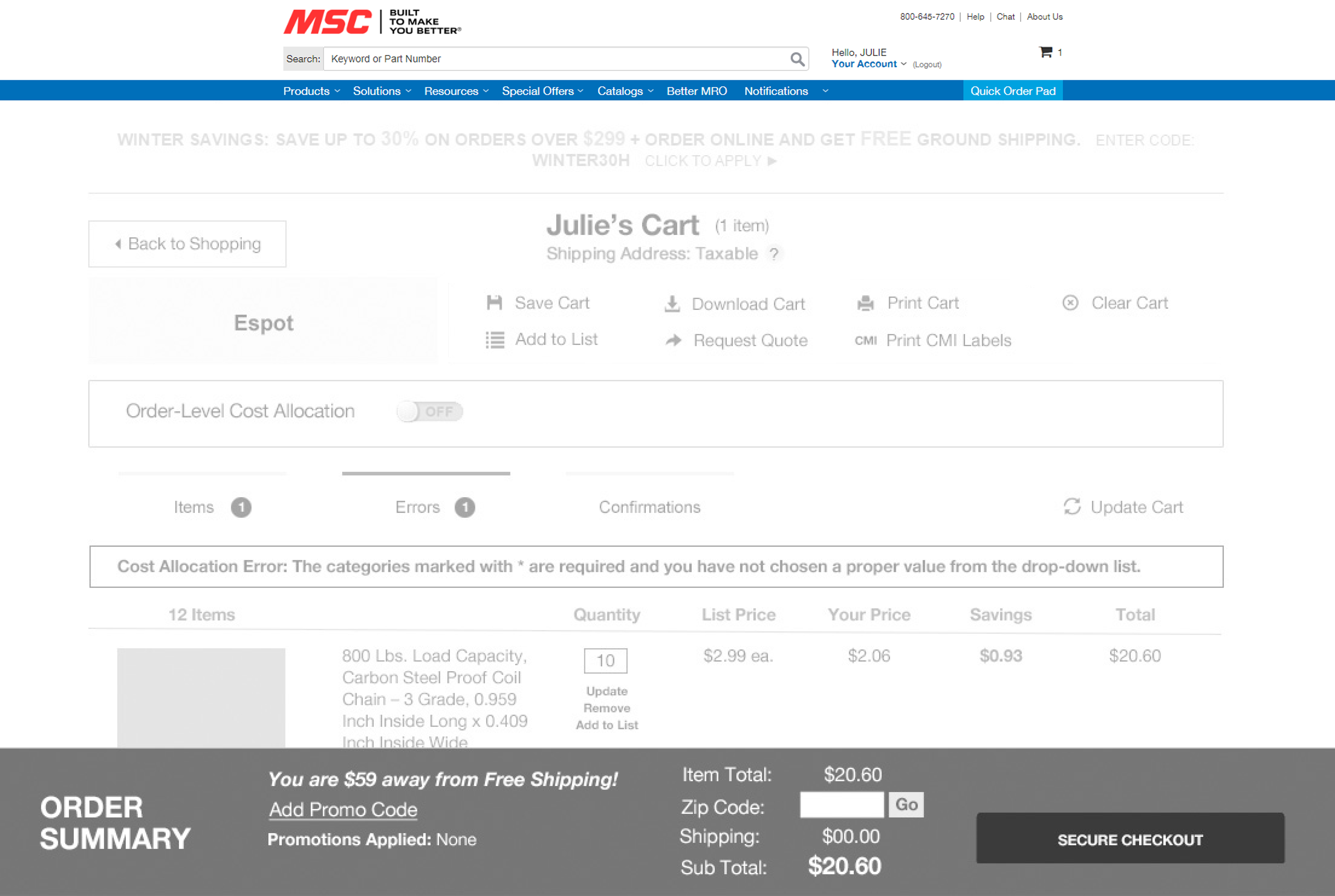
There was debate in the stakeholder meeting, as our team emphasized web best practices for the placement of the order summary. In the end, the director of e-Commerce decided to go with the design with the presistent order summary bar at the bottom of the cart.
Testing:
With Optimal Workshop, I did a chalkmark test to test findability of the price within the order summary, among other things. The tests went well, so we launched the product.
Outcomes & Results:
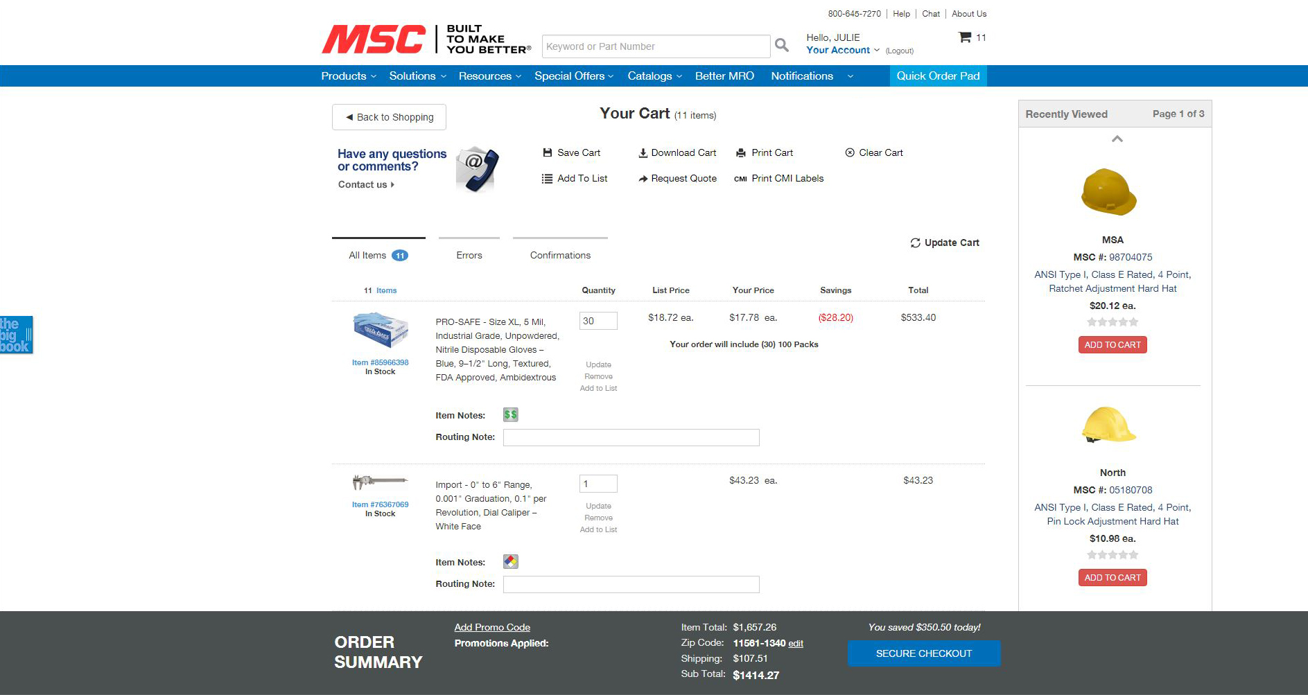
The cart order summary redesign was well-received by customers, at first. Over a few weeks, we received feedback on the ForeSee survey and through customer service that the customers were having trouble finding the secure checkout button, so we had to add one at the top of the cart.
When we decided to take the site responsive, the order summary at the bottom looked too small on the phone, so we went back to our original solution.
Need a Consultant or Full-time Associate? Let's Chat: 347-683-6091.
